


Luke Bird, book cover designer
Let the award-winning cover artist for Convenience Store Woman and Booker winner Milkman choose your next read


A note from me: It’s not the most auspicious start when the second Written Approval newsletter is not just late, it’s also sliced in half. But you’ll forgive me for this: there was the patchy work schedule of summer, alongside a word count for this edition that had Substack flashing warning signals at me. So this month there will be two newsletters, and the follow up to this will feature regulars including an attempt at matching songs to my reading list, and a special competition in conjunction with the wonderful Handheld Press. In the meantime, I hope you enjoy this interview…
Covers aren’t everything, but one should not be spared the pure delight of putting pictures before prose from time to time. For me, it’s those out-of-print novels whose designs have stood the test of time that appeal most. My own favourite is a rather splendid, verging on creepy, vintage copy of Virginia Woolf’s Mrs Dalloway who’s all hatted up and ready to step out for the day. I’m a sucker, too, for staying true to a special collection, and I’m particularly proud of my reissued set of Chimamanda Ngozi Adichie novels, jacketed in the style of African wax prints designed by Jo Walker for 4th Estate.
On the other end of the scale, I cannot deny the pleasing effect of a plain dove grey Persephone book, or uniform elegant deep blue of a Fitzcarraldo Edition.
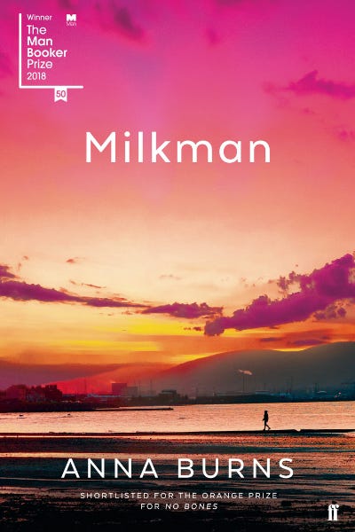
Very few book designers, if any, are household names, but from a publishing perspective they can have a major influence on the outcome of a book. Anna Burns, for instance, would certainly vouch that her intense sunrise on the front of her Booker winning novel Milkman is part of its success (pictured above). Another Booker favourite Paul Auster may feel the same about his photographic jacket of 4, 3, 2, 1. The person responsible for both these covers is designer and art director Luke Bird.
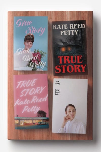
Without knowing, you might well own a Luke Bird creation yourself. Looking up from my desk I spot two: the yellow lettering against a blue backdrop of Kazuo Ishiguro’s The Buried Giant (Faber) and the pink and green leaf design of Julianne Pachico’s The Lucky Ones (Faber). Having worked at Faber in-house he’s now freelance, and carving out a reputation for creating some of the cleverest covers around. I loved his rather bonkers four-in-one design for Kate Reed Petty’s True Story (pictured above), which had many book enthusiasts raving. Designers aren’t usually part of the conversation about the success of a book, but they should be.
So, I’ll hand over to Luke now who’ll talk more about his career and the books he reckons you should read next.
I’m Luke. I’m a graphic designer, specialising in book cover design. I live and work in a picturesque little village in the North York Moors, but can also be seen – frequently – travelling up and down the East Coast Main Line to London. Growing up, our house was always full of books; everyone in my family read. My grandmother had a dusty pile of them in her cottage that my great-grandfather had had rebound in beautiful half and quarter-bindings of cloth and leather, with marbled paper and gilt lettering from about the late 19th century. I spent hours looking at the covers and spines and running my fingers over the bindings, taking in their beauty as objects. Perhaps it’s no surprise that I ended up working on the outsides of books, rather than the insides.
“My Gran had a pile of dusty old books in her cottage that my great-grandfather had had rebound in beautiful half and quarter-bindings of cloth and leather, with marbled paper and gilt lettering from about the late 19th century”
The first book I can remember falling in love with was Ralph Steadman’s Jelly Book, from 1967. I was about five or six years old, and I guess it must have been my mum’s as a child. Sure, the illustrations were amazing and amusing in equal measure, and Steadman’s story is wonderfully eccentric, but what really sticks in my memory is the plain orange, hardback, clothbound book which I found underneath the book’s paper jacket when I removed it. Even now, I’m not sure I can put my finger on exactly why, but something about it made me - and still makes me - extremely happy. The texture of the cotton, perhaps, or the contrast of the vivid, bright orange cloth peering out from underneath the coated white jacket.
“The feeling of seeing something you have created sitting on a bookshelf in someone’s house or in a shop is every bit as rewarding now as it was then”
My first job was at Canongate Books in Edinburgh. They only had two designers – including me –so I learned on the job fast, from commissioning illustration, photography and artwork as well as designing covers myself. The feeling of seeing something you have created sitting on a bookshelf in someone’s house or in a shop is every bit as rewarding now as it was then.
“This was the moment that I realised that book design and production is one of the most - if not the most - adventurous and free-thinking of all the design disciplines”
The first time I got my hands on a limited edition book was at Canongate. Long before I joined they produced a limited run of Robert Sabbag’s novel Snowblind, designed by Damien Hirst (yes, that Damien Hirst), and featuring boards made of reinforced mirrors. Real, actual mirrors. Inside the book, a special die-cut trench runs through the pages and, hidden inside this trench, is a real $100 note. Apparently, the final three digits of the note corresponded to the edition number of the book and were specially secured from the U.S. Treasury. The ribbon has a fake metal American Express-esque credit card dangling from the end, and the whole lot sits in a slipcase decorated with reproduced dollar bills. This was the moment that I realised that book design and production is one of the most - if not the most - adventurous and free-thinking of all the design disciplines.

Next, I ended up at Faber & Faber. I had always loved their typographic approach to design and I longed to be part of that. I was lucky to design exciting new novels for big literary names, like Kazuo Ishiguro, Paul Auster and David Peace, and fabulously talented new names like Vivek Shanbhag, Thomas Morris and Julianne Pachico.
“I’m lucky enough to have won an ABCD award for Sayaka Murata’s Convenience Store Woman”
While I was there, fellow designers Jon Gray and Jamie Keenan set up the Academy of British Cover Design Awards. I count the eight shortlistings I received for covers I produced while I was at Faber to be a real career highlight, and I’m lucky enough to have won an ABCD award since I left for Sayaka Murata’s Convenience Store Woman (more on that, below).
In 2017, I decided that it was time for me to go it alone, setting up as a freelance designer working with Penguin, Vintage, 4th Estate, Bloomsbury, Harville Secker, Ebury, Little, Brown, Faber & Faber, Granta, Hardie Grant, to name a few.
Covetable covers and the stories behind them. Here’s what to read next, as chosen by Luke
Ghachar Ghochar by Vivek Shanbhag, translated by Srinath Perur. Faber

“I first read Vivek Shanbhag’s English-language debut in 2017, when his editor, Mitzi Angel, gave the cover design briefing-form to the design department at Faber & Faber. It’s a short novella, translated from Kannada into English for this edition. The book has all the hallmarks of a cult classic; it crams in family, love, beauty, vivid colour, corruption, darkness and deftly-written wry humour into a short but concise package. It is – to put it simply – a throughly enjoyable thing to read.
I particularly love Shanbhag’s eye for detail, and there is one passage in which the narrator describes the family’s battle with an ant infestation:
“These ants entered the house in orderly columns, then began to wander everywhere in apparent confusion, always bumping heads and pausing before seeming to realise something and rushing off in random directions. They had no discernible purpose in life other than trying our patience”
I ended up using it as inspiration for the endpaper design, which features thousands of tiny graphic black ants.
You get some covers ‘right’ straight away. This was not one of them. At one point, the whole of Faber’s design department was working on it, and at least a hundred covers would have been rejected before we settled on the final one. Indeed, it wasn’t until I started trying to riff on Faber’s rich design heritage that we got somewhere approaching a final cover.
Their archives are packed to the rafters with Wolpe and Tucker’s beautiful graphic and typographic jackets, which have become quite iconic. I created a modernist, grid-based cover inspired by Wolpe’s classic covers, and used Franklin Gothic for the author’s name, after seeing Seamus Heaney and Sylvia Plath’s names set in the same typefaces, in other eras.
Rather than settle for something we’d all seen before – however beautiful – I wanted to subvert the grid and create a little more mess. After all, the book’s title is an invented word/term meaning ‘entangled beyond repair’. I rotated the bottom panel so it no longer adhered to the ‘grid’ approach, and staggered alternate letters of the hand-modified title typeface to reinforce the concept. For extra zing, I suggested printing this lower panel in a vivid, neon pink Pantone.”
Pew by Catherine Lacey. Granta
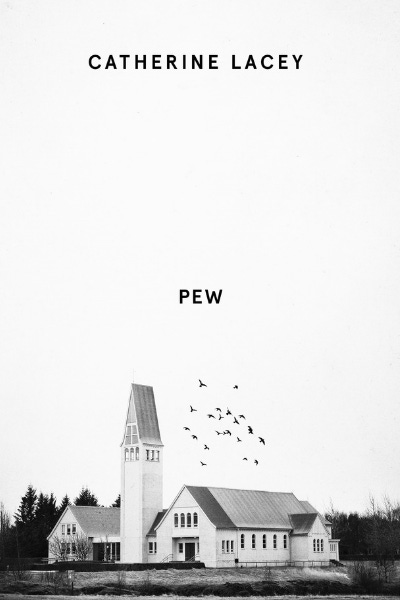
“I’ve been designing more of what some people might call ‘modern literary horror’ of late. Not slasher-horror, but unsettling, eerie things with seem to stay with you. Certainly, they are more Midsommar than Nightmare on Elm Street.
I designed Pew for Granta last year and I loved the novel. It’s Catherine Lacey’s debut, and it centres around an unnamed character found sleeping on a church pew in an American town. They have no specific gender or race, and they very rarely speak. The town cannot agree on how to treat this person they cannot categorise, and the residents of the community are profoundly disturbed by Pew’s continued silence.
As a fan of Edgar Allan Poe’s more macabre side and Robert Aickman’s penchant for making you feel uncomfortable, I guess it’s no surprise I loved this as much as I do. I thought the best way to show the silence at the heart of the novel was through the depiction of space on the cover. A church right out of the Southern American Gothic playbook sits right at the base of the cover, and a small flock of black birds adds a touch of the Hitchcock to proceedings.”
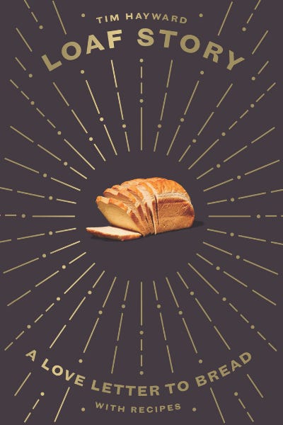
Loaf Story by Tim Hayward. Quadrille
“Alongside literary fiction, I love reading really good food writing. One of my favourite ever books (I didn’t work on this one, sadly) is Rachel Roddy’s love-letter to the time she spent living in – and discovering the food of – Rome called Five Quarters. Undoubtedly cheesy though it sounds, I feel like I’m walking the streets of Testaccio with her.
Among other things, Tim Hayward is a writer, restauranteur and broadcaster. As well as being infectiously passionate on and off the page about food and creativity, he has that incredible knack of making you laugh out loud. I can’t think of a book I’ve enjoyed designing as much as this.
His latest book is an ode to the humble loaf of bread. Tim owns a bakery, so good bread is clearly incredibly important to him. But Loaf Story does not labour over the delights of 72-hour-fermented works of flour-art. Or not at its heart. It’s a celebration of what makes us all love bread, from a sliced-white tin loaf that we remember from our childhood, to something a little more adventurous.
We commissioned Sam Folan to photograph Tim’s bread-based recipes. Sam had some beautifully colourful work for Yo Sushi! in his portfolio, but also some really clean, modern contemporary shots, and we felt that somewhere in the middle of these might be the perfect fit. Sam’s an ex-chef, which means he is particularly adept at capturing the dish’s deliciousness on the page.
I wanted the cover to be an unashamed celebration of the ordinary loaf, so we shot one of Tim’s lovely white loaves against a black background and I added lots of rays, which we blocked in gold foil. The kind of thing you might see on the cover of an old bible, or in one of the illustration plates inside it.”
Convenience Store Woman by Sayaka Murata, translated by Ginny Tapley Takemori. Granta

“Convenience Store Woman is the story of Keiko, and her struggles to fit in socially in contemporary Japan. To please her family – who think she is odd – she gets a job at a convenience store (which she likes), and the book chronicles her time in and outside of the store as she tries (and fails) to adhere to the vision of how others see her life.
“You eliminate the parts of your life that others finds strange. Maybe that’s what everyone means when they say they want to “cure me”.”
It is charming and strange and I loved it. There is something gloriously off-beat about the novel.
My initial cover visuals centred around some amazing photographs of real Japanese convenience stores, and on Keiko herself. I thought that if I obscured her face on the cover it would reference her wish for anonymity, as well as her charm and her awkwardness. None of these were felt to be right, so I went back to the drawing board.
One of the routes the brief suggested was to look at Japanese food packaging, which is always brightly coloured and often replete with as many large slogans as you can fit onto a small package. I thought it might be fun to try bring some of that energy onto the cover.
I noticed that – as in lots of countries – Japanese convenience store workers wear name tags, and I thought that could be something worth exploring, too. It was another way to reference Keiko’s anonymity, as well as a way of featuring something very mundane on the cover of the book, which felt right.”
Plume by Will Wiles. 4th Estate
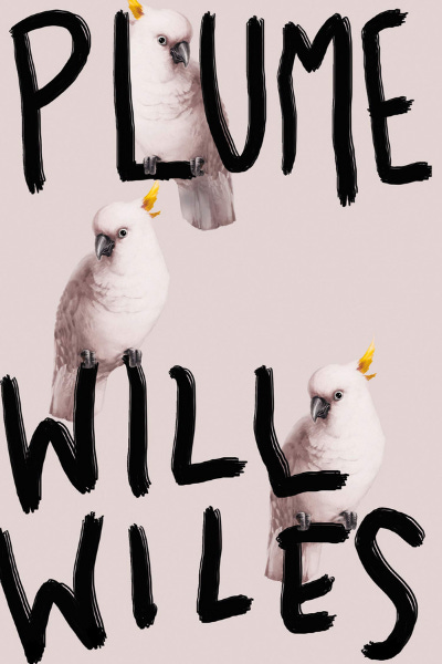
“As you’ve probably gathered by now, I am drawn to contemporary literature with a touch of darkness and – more often than not - a generous dose of humour.
I LOVED Plume so much that I was almost scared of designing it. There’s certainly an added, internal pressure to get it right when you really connect with a book, as a reader.
Jack, our main character in the novel, journeys from functioning alcoholism to non-functioning alcoholism. Both his work and personal lives unravel spectacularly and at alarming speed as he comes to terms with his addiction. It’s a very modern, funny novel which deals with some quite sober topics, and I thought the balance was really clever.
The hallucinations Jack experiences as part of his perennially drunken state - which he knows aren’t real, even as they are happening – are often amusing. At one point, he becomes so furious with the ‘vengeful cockatoo’ who is stalking him (it’s actually a white plastic bag caught in a tree), he sets out on a mission to remove the cockatoo from it’s perch and - while successful - injures himself badly in the process.
4th Estate gave me a really open brief, and told me to think of the kind of thing that might get shortlisted for a design award, which is a dream as a designer, so I let my imagination and creativity run wild, a bit.
The birds reference Jack’s imaginary cockatoo stalker, but I liked the double meaning of the ‘plume’ on top of the cockatoo’s head (even though that’s not quite the kind of plume that the novel’s title alludes to). The particular illustration of a bird that I found had a really maniacal look in its eyes, and I thought repeating them (three appear on the final cover) would also reference Jack’s colleagues at the disciplinary panel who are, of course, out to get him.
For the type, I opted for something hand-rendered, to reference Jack’s chaotic life, and contrast against the dirty, pale pink background.”
Win this month’s recommended books!
A complete stack of all Luke’s favourite reads is yours to be won. To enter, hit subscribe (if you haven’t already) and share this newsletter on one of your social media channels with a recommended read of your own. The competition closes on Friday 18 September with the winner announced the following week. UK residents only.
Interested in Luke’s books and topics? Here’s further reading and watching…
🗞️ LitHub: Loitering in 7-11 with Convenience Store Woman Author Sayaka Murata. I started reading her new novel Earthlings and it’s desperately sad (and also bonkers).
🗞️ The Independent: Ghachar Ghochar. This Novella Packs a Punch. By the always insightful Lucy Scholes.
💸 Goldsboro Books in London has a limited edition copy of Snowblind that Luke talks about. A snip at £1,000!
You can find Luke on his website www.lukebird.co.uk and on Instagram @lookbird
What’s on your reading list?
Thank you for reading the second edition of Written Approval! It’s been split in two this month because there was too much to cram into one. Expect another newsletter to drop in the next couple of weeks (a one-off - I promise not to overload your inbox!)
If you enjoyed this post, I would love you to share it with friends.
Written Approval by Julie Vuong @julesvuong
Illustration by Aniko Aliyeva @anyevastudio
Logo designed by Willow Design Studio
A note on how Written Approval is funded
Written Approval is free to read. In future, to help build it, I hope to add subscriber options. The best way right now to support me is to share and subscribe. There will be affiliate links in future, which won’t cost you anything but gives something back to the newsletter.
Being on #bookstagram has made me obsessed with book covers. LOVED this chat with Luke and getting insights into book design.